Using Bootstrap Styling
Getting
started with Bootstrap
Designing
pages with Bootstrap
See also: Bootstrap 4 documentation
Introduction
This document provides an introduction to using the Bootstrap styling framework with Verj.io. Bootstrap is a free front-end framework for faster and easier web development. Some of the advantages of using Bootstrap are:
- It gives you the ability to easily create responsive designs i.e. web pages that adjust automatically to different device sizes, phones, tablets, desktops etc.
- Mobile-first styles are part of the core Bootstrap framework
- Bootstrap is compatible with all modern browsers (Chrome, Firefox, Internet Explorer 10+, Edge, Safari, and Opera). However, Internet Explorer 9 and down is not supported.
To use Bootstrap with Verj.io it helps if you have at least a basic knowledge of HTML and CSS, but this is not absolutely essential as the basics are provided for you out-of-the-box.
This documentation applies to Bootstrap 4.
Verj.io Bootstrap Support
We’ve added a number of features to Verj.io to make it really easy to use Bootstrap, including:
- A Bootstrap presentation template – named bootstrap4 (you’ll find this in the VerjSamples project). This template is based on Bootstrap V4 and contains control property sets adapted for use with Bootstrap. The latest version of this template can be downloaded into your workspace from the Resource Hub.
- Bootstrap-specific controls:
· Bootstrap Container Control – a root container that provides side gutters and is required for Bootstrap grids
· Bootstrap Row Control – represents a row in a bootstrap grid
· Bootstrap Column Control – represents a column in a bootstrap grid
- A layout to present fields in a grid - Bootstrap Field Layout
- Bootstrap properties for existing controls
- Bootstrap-specific generated HTML for Field Controls
Most Bootstrap styling is implemented by applying CSS classes to the appropriate HTML elements. In addition to the specific items above, you can implement Bootstrap styling by just adding the required classes to the Verj.io controls – most classes have a class property under the Style heading, more complex controls that multiple HTML elements will usually have multiple classes and these can be configured via the controls’ styling assistants (right click on any control, select Style).
Getting started with Bootstrap
The easiest way to start using Bootstrap is to use the supplied bootstrap4 presentation template. If you don’t have this in your system you can download it from the Resource Hub. Then set this as the default template in the studio by clicking File > Preferences then setting the Default Presentation Template property; this template will then be used for all new forms.
If you don’t want to use the supplied bootstrap4 template for some reason, you can still take advantage of the Verj.io bootstrap support by setting the framework form property for individual forms (Form Properties > Presentation), but if you do this you will also need to add the bootstrap CSS as a web resource at form level.
Follow the Bootstrap track in the Resource Hub for an introduction and practical advice on using Bootstrap with Verj.io.
Designing pages with Bootstrap
Page gutters (margins)
By default a new page will use the full page width with no gutters. This is fine if you want a navigation bar and/or a header image to fill the entire width, but for text content you will need side margins (gutters). To achieve this, add a Bootstrap Container Control to the page and set its Container Type property to:
- Centered: a centered layout with relatively large side margins - the container width varies depending on the device size (this corresponds to the Bootstrap container class)
- Full Width: a full width container with a relatively small side margin (this corresponds to the Bootstrap container-fluid class)
You can also select these same options for an entire page by setting the Root container type property (under Bootstrap) of the root Page Control.
One of these two options is required to use a Bootstrap Grid: either a Bootstrap Container Control or a Page Control with the Root container type property configured.
Bootstrap Grid
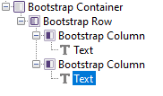
Bootstrap’s grid system uses a series of rows and columns to layout and align content. It’s built with flexbox and is fully responsive. You achieve this with Verj.io by adding Bootstrap Row and Bootstrap Column controls to the page. Here’s a simple example with a two column layout, you can find a more detailed discussion in Bootstrap Grid Controls:

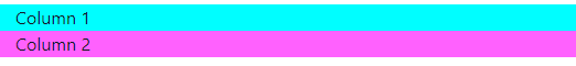
As the device viewport width decreases, this will eventually break to two vertical columns; the intention is that this breakpoint occurs for extra small devices (i.e. phones):
You can use the Bootstrap Breakpoint Column Properties of the Bootstrap Column Control to set the relative widths and breakpoints for all the columns, and these can vary for different device sizes. (This is equivalent to setting the various col-xx classes in Bootstrap.)
More info on bootstrap grids: Bootstrap Grid Controls and Bootstrap Grid Documentation
Displaying Fields
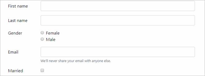
The default if you don’t specify any layout on the container control is to lay the fields out vertically with the labels above the editor inputs:

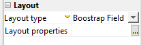
You can achieve a horizontal form layout by using the Bootstrap Field Layout on the parent container control. This layout is responsive and will break to the vertical layout shown above for very small device viewport sizes (the break points can be configured using layout properties). Note that this layout should be used in preference to the legacy Field Grid Layout with Bootstrap because the latter is not responsive.
Buttons and Hyperlinks
Bootstrap comes with a number of predefined styles for buttons and links e.g. primary, secondary, success danger etc e.g.

These styles can be configured for all Verj.io buttons and hyperlinks using the Bootstrap Properties within each control’s styling assistant e.g. right click on a button, select Style to show the styling assistant:

See Button Control Properties for more details.
What Next
Follow the Bootstrap track in the Resource Hub.