Widgets
See also: Controls
Introduction
Widgets provide specific pieces of UI functionality e.g. a chart, a map, a confirmation popup etc. Internally a widget will consist of a part-page component containing any number of controls plus optionally, any additional entities that the widget needs such as client or server side scripts, CSS etc. The available widgets are shown in the Widgets View and widgets are added or dragged on to a page in the same way as controls.
Typically you would then configure the widget to your requirements e.g. for a chart you would need to configure how the source data to be charted is obtained, you might want to set axis labels etc.
Widget Structure
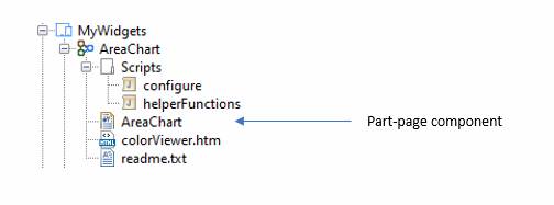
A widget consists of a directory containing:
- A part-page component (this is the UI part of the widget) containing any number of controls, fields, tables, resources etc.
- Any number of additional entities, Javascript files, CSS files etc that are needed for the widget’s functionality. These additional entities must be contained within the widget’s directory structure i.e. it is not possible to refer to an entity outside of the widget’s directory.
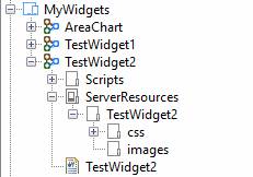
Here’s an example of a widget. Note that this is the widget source which is slightly different from how it will look when installed, as we’ll see in a moment.
Adding a widget to a page
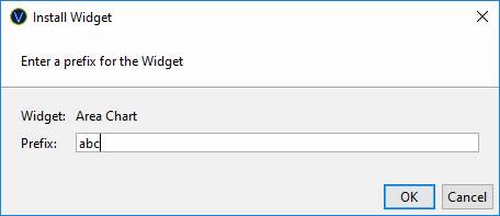
To add a widget to a page, just drag it from the Widgets View to the appropriate place in the Outline View or the WYSIWYG View. The system displays a prompt for the widget prefix – this is used to make each installed widget unique:
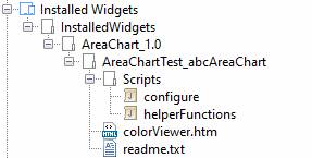
You will then see the widget in the Outline View:

At the same time any additional entities such as scripts, css etc that form part of the widget are copied to the Installed Widgets project in your workspace - into a directory structure consisting of the widget name, the widget version, the form name (AreaChartTest in this example) and the widget prefix. This structure allows the same widget to be added several times to the same page if necessary – each widget instance will have its own set of additional entities which can be configured independently.
Configuring the widget
Each widget is different from the next so the best thing is to look at the documentation for the widget you’re working on (see next section – Widget Documentation). But typically, you can expect to see a client-side Javascript file named configure which contains most, if not all, of the configuration options. So as an example, if we take a look at the configure script for this AreaChart widget, we will see that it contains two functions: config and getData and these will both need to be configured.
The config function looks like this and mainly contains options about how the chart should look:
function config()
{
var
options = {
responsive:
true,
smoothing :
false,
labels : [
'Jan',
'Feb',
'Mar',
'Apr',
'May',
'Jun',
'Jul'
],
displayTitle :
true,
titleText :
'Stacked Area Chart',
xAxisLabelDisplay :
true,
yAxisLabelDisplay :
true,
xAxisLabel :
'Months',
yAxisLabel :
'Values',
xAxisGridLines :
true,
yAxisGridLines :
true,
yAxisStepSize :
50
}
return options;
}
The getData function looks like this and supplies the data values to be charted – in this case, three separate lines consisting of random numbers:
function getData()
{
var
dataset = [];
var
color = chooseColor({method:'byName',returnAs:'hex',searchTerm:'red'});
var
data =
{
label:
'Product 1',
backgroundColor: color,
borderColor: color,
data: [
random(200),
random(200),
random(200),
random(200),
random(200),
random(200),
random(200)
],
fill:
'start',
};
dataset.push(data);
.. repeat twice
to add a second and third set of data to be charted
return dataset;
}
Widget Documentation
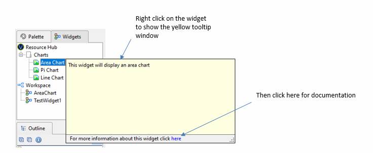
To obtain documentation on the widget, how to configure it etc, right click on the widget in the Widgets View and then click on the link at the bottom of the yellow panel. This displays the widget documentation from the Resource Hub.
Documentation will also be included with any scripts and other entities that form part of the widget.
Creating your own widgets
To create a widget, right click in the tree and select New > Widget. This will create a directory with the widget name plus a part page component, also with the widget name. Any additional entity files required for the widget must be created within this directory structure. When the widget is installed into a form everything inside the containing directory, with the exception of the part-page component, will be copied to a unique directory structure within the Installed Widgets project.
The widget will appear automatically in the Widgets View when a form is next opened.
Widget Rules
- A widget cannot refer to an entity outside its directory structure (an exception to this rule is the reference from the part page component to a presentation template)
- A widget cannot contain more than one component
- Server Resources folders should only contain static resource files i.e. resources which do not need to be customized for each individual installation. This is because only a single copy of each Server Resources folder is maintained in the Installed Widgets project and this is shared by all installations of that widget.
Server Resources
Folders
If a widget contains a Server Resources folder, all web resources within this should be placed inside a folder containing the widget name. This is to ensure that one widget’s resources don’t override the resources of another widget when they are copied to the server e.g.