Page Navigation Panel Control
See also: Ebase Page Sequencing, Save/Restore Feature, Styling Assistants, Introduction to Styling, Controls
Description
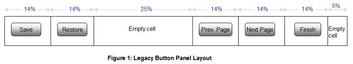
This control includes the following five buttons:
- Save Button (See Save/Restore Feature). This is equivalent to a Save Button Control.
- Restore Button (See Save/Restore Feature) . This is equivalent to a Restore Button Control.
- Previous Page Button (See Ebase Page Sequencing) . This is equivalent to a Previous Page Button Control.
- Next Page Button (See Ebase Page Sequencing) . This is equivalent to a Next Page Button Control.
- Finish Button (See Ebase Page Sequencing) . This is equivalent to a Finish Button Control.
If required, a Page Navigation Panel Control can be added automatically when a new page is created – see the Page Editor tab of Designer Preferences.
At runtime, each button is either hidden or displayed based on the current circumstances. Click the links for each of the controls above to see when each button is displayed.
In the WYSIWYG
View, the toggle hidden controls icon  on the toolbar behaves as follows:
- On: each button is hidden or displayed based on runtime circumstances. Click the links for each of the controls above to see when each button is displayed.
- Off: all buttons are always displayed
Each button can be displayed as either a
button or as a clickable image. When displayed as an image, a System Text
is used as an alternate text. Click the links for each of the controls above to
see the system text id.
The buttons are written in a table with a
single row as shown below:
Compatibility note! this control provides equivalent functionality to the save/restore and page navigation buttons displayed at the bottom of each page with Ebase Version 3.4 and earlier releases. Insert this control as the last control on each page to achieve the same behaviour.
Properties
See also control common properties and local/inherited control properties.
Style Tab – Styling Assistant
The properties and the Interactive Preview are divided into sections that represent different parts of a Page Navigation Panel Control. Each section can be selected from the Edit Properties dropdown or by clicking on the appropriate area in the preview. The sections are:
- Legacy Panel – properties for the panel container and default properties for all buttons
- Next Button – properties for the next page button
- Previous Button – properties for the previous page button
- Finish Button – properties for the finish button
- Save Button – properties for the save button
- Restore Button – properties for the restore button

|
Property |
Description |
Name1 |
Type1 |
Get1 |
Set1 |
Get/Set Values1 |
|
The following properties apply to the panel container and all buttons. |
|
|
|
|
|
|
|
Panel Properties:
properties for the panel container |
||||||
|
Width |
Sets the width for the entire Page Navigation Panel Control. Warning: any margins will be in addition to the specified value and can cause the Page Navigation Panel Control to “break out” of its parent space. Click here for further info. See also: hints and tips, understanding width. |
width |
Character |
Yes |
Yes |
As per CSS width property. |
|
Background |
Sets the background properties for the button panel. See background properties. |
|
|
|
|
|
|
Border |
Sets the border properties for the button panel. See border properties. |
|
|
|
|
|
|
Margin |
Margin is the space beyond the border. See padding and margin properties. |
|
|
|
|
|
|
Button Properties:
default properties for all buttons |
||||||
|
Text |
Sets the text properties for the button: font, size, color, bold, italic etc. See text properties. |
|
|
|
|
|
|
Background |
Sets the background properties for the button. See background properties. |
global .xxx |
|
|
|
|
|
Border |
Sets the border properties for the button. See border properties. |
global .xxx |
|
|
|
|
|
Padding |
Padding is the space inside the button border. See padding and margin properties. |
global .xxx |
|
|
|
|
|
Bootstrap: These properties are only available when a form is configured to use bootstrap i.e. the framework property in Form Properties is configured to use bootstrap (by default this property is inherited from the Presentation Template). See Using Bootstrap with Verj.io. |
||||||
|
Style |
Sets the Bootstrap style. This results in the addition of the appropriate bootstrap classes. |
global.bootstrapStyle |
Character |
Yes |
Yes |
Primary Secondary Success Danger Warning Info Light Dark Link Outline Primary Outline Secondary Outline Success Outline Danger Outline Warning Outline Info Outline Light Outline Dark |
|
Size |
Sets the Bootstrap size. This results in the addition of the appropriate bootstrap classes. |
global.bootstrapSize |
Character |
Yes |
Yes |
Large Small |
|
State |
Sets the Bootstrap state. This results in the addition of the appropriate bootstrap classes. |
global.bootstrapState |
Character |
Yes |
Yes |
Active Disabled |
|
|
|
|
|
|
|
|
|
Style |
CSS class and inline style for the panel container. |
cssClass style |
Character |
Yes |
Yes |
As per HTML class parameter As per HTML style parameter |
|
The following properties apply to the next page button and override the default properties for all buttons specified in the Legacy Panel section. |
|
|
|
|
|
|
|
Text |
Sets the text properties for the button: font, size, color, bold, italic etc. See text properties. |
next .xxx |
|
|
|
|
|
Background |
Sets the background properties for the button. See background properties. |
next .xxx |
|
|
|
|
|
Border |
Sets the border properties for the button. See border properties. |
next .xxx |
|
|
|
|
|
Padding |
Padding is the space inside the border. See padding and margin properties. |
next .xxx |
|
|
|
|
|
Bootstrap: These properties are only available when a form is configured to use bootstrap i.e. the framework property in Form Properties is configured to use bootstrap (by default this property is inherited from the Presentation Template). See Using Bootstrap with Verj.io. |
||||||
|
Style |
Sets the Bootstrap style. This results in the addition of the appropriate bootstrap classes. |
next.bootstrapStyle |
Character |
Yes |
Yes |
Primary Secondary Success Danger Warning Info Light Dark Link Outline Primary Outline Secondary Outline Success Outline Danger Outline Warning Outline Info Outline Light Outline Dark |
|
Size |
Sets the Bootstrap size. This results in the addition of the appropriate bootstrap classes. |
next.bootstrapSize |
Character |
Yes |
Yes |
Large Small |
|
State |
Sets the Bootstrap state. This results in the addition of the appropriate bootstrap classes. |
next.bootstrapState |
Character |
Yes |
Yes |
Active Disabled |
|
|
|
|
|
|
|
|
|
Style |
CSS class and inline style for the button. |
nextClass nextStyle |
Character |
Yes |
Yes |
As per HTML class parameter As per HTML style parameter |
|
Display As Image |
Indicates that the button is displayed as an image. The image URL is then configured using the Image URL property. |
nextDisplayAsImage |
Boolean |
Yes |
Yes |
|
|
Image Url |
Specifies the URL for the image when Display as image is selected. |
nextImageURL |
Character |
Yes |
Yes |
See URL properties for more information. |
|
The following properties apply to the previous page button and override the default properties for all buttons specified in the Legacy Panel section. |
|
|
|
|
|
|
|
Text |
Sets the text properties for the button: font, size, color, bold, italic etc. See text properties. |
previous .xxx |
|
|
|
|
|
Background |
Sets the background properties for the button. See background properties. |
previous .xxx |
|
|
|
|
|
Border |
Sets the border properties for the button. See border properties. |
previous .xxx |
|
|
|
|
|
Padding |
Padding is the space inside the border. See padding and margin properties. |
previous .xxx |
|
|
|
|
|
Bootstrap: These properties are only available when a form is configured to use bootstrap i.e. the framework property in Form Properties is configured to use bootstrap (by default this property is inherited from the Presentation Template). See Using Bootstrap with Verj.io. |
||||||
|
Style |
Sets the Bootstrap style. This results in the addition of the appropriate bootstrap classes. |
previous.bootstrapStyle |
Character |
Yes |
Yes |
Primary Secondary Success Danger Warning Info Light Dark Link Outline Primary Outline Secondary Outline Success Outline Danger Outline Warning Outline Info Outline Light Outline Dark |
|
Size |
Sets the Bootstrap size. This results in the addition of the appropriate bootstrap classes. |
previous.bootstrapSize |
Character |
Yes |
Yes |
Large Small |
|
State |
Sets the Bootstrap state. This results in the addition of the appropriate bootstrap classes. |
previous.bootstrapState |
Character |
Yes |
Yes |
Active Disabled |
|
|
|
|
|
|
|
|
|
Style |
CSS class and inline style for the button. |
prevClass prevStyle |
Character |
Yes |
Yes |
As per HTML class parameter As per HTML style parameter |
|
Display As Image |
Indicates that the button is displayed as an image. The image URL is then configured using the Image URL property. |
prevDisplayAsImage |
Boolean |
Yes |
Yes |
|
|
Image Url |
Specifies the URL for the image when Display as image is selected. |
prevImageURL |
Character |
Yes |
Yes |
See URL properties for more information. |
|
The following properties apply to the finish button and override the default properties for all buttons specified in the Legacy Panel section. |
|
|
|
|
|
|
|
Text |
Sets the text properties for the button: font, size, color, bold, italic etc. See text properties. |
finish .xxx |
|
|
|
|
|
Background |
Sets the background properties for the button. See background properties. |
finish .xxx |
|
|
|
|
|
Border |
Sets the border properties for the button. See border properties. |
finish .xxx |
|
|
|
|
|
Padding |
Padding is the space inside the border. See padding and margin properties. |
finish .xxx |
|
|
|
|
|
Bootstrap: These properties are only available when a form is configured to use bootstrap i.e. the framework property in Form Properties is configured to use bootstrap (by default this property is inherited from the Presentation Template). See Using Bootstrap with Verj.io. |
||||||
|
Style |
Sets the Bootstrap style. This results in the addition of the appropriate bootstrap classes. |
finish.bootstrapStyle |
Character |
Yes |
Yes |
Primary Secondary Success Danger Warning Info Light Dark Link Outline Primary Outline Secondary Outline Success Outline Danger Outline Warning Outline Info Outline Light Outline Dark |
|
Size |
Sets the Bootstrap size. This results in the addition of the appropriate bootstrap classes. |
finish.bootstrapSize |
Character |
Yes |
Yes |
Large Small |
|
State |
Sets the Bootstrap state. This results in the addition of the appropriate bootstrap classes. |
finish.bootstrapState |
Character |
Yes |
Yes |
Active Disabled |
|
|
|
|
|
|
|
|
|
Style |
CSS class and inline style for the button. |
finishClass finishStyle |
Character |
Yes |
Yes |
As per HTML class parameter As per HTML style parameter |
|
Display As Image |
Indicates that the button is displayed as an image. The image URL is then configured using the Image URL property. |
finishDisplayAsImage |
Boolean |
Yes |
Yes |
|
|
Image Url |
Specifies the URL for the image when Display as image is selected. |
finishImageURL |
Character |
Yes |
Yes |
See URL properties for more information. |
|
The following properties apply to the save button and override the default properties for all buttons specified in the Legacy Panel section. |
|
|
|
|
|
|
|
Text |
Sets the text properties for the button: font, size, color, bold, italic etc. See text properties. |
save .xxx |
|
|
|
|
|
Background |
Sets the background properties for the button. See background properties. |
save .xxx |
|
|
|
|
|
Border |
Sets the border properties for the button. See border properties. |
save .xxx |
|
|
|
|
|
Padding |
Padding is the space inside the border. See padding and margin properties. |
save .xxx |
|
|
|
|
|
Bootstrap: These properties are only available when a form is configured to use bootstrap i.e. the framework property in Form Properties is configured to use bootstrap (by default this property is inherited from the Presentation Template). See Using Bootstrap with Verj.io. |
||||||
|
Style |
Sets the Bootstrap style. This results in the addition of the appropriate bootstrap classes. |
save.bootstrapStyle |
Character |
Yes |
Yes |
Primary Secondary Success Danger Warning Info Light Dark Link Outline Primary Outline Secondary Outline Success Outline Danger Outline Warning Outline Info Outline Light Outline Dark |
|
Size |
Sets the Bootstrap size. This results in the addition of the appropriate bootstrap classes. |
save.bootstrapSize |
Character |
Yes |
Yes |
Large Small |
|
State |
Sets the Bootstrap state. This results in the addition of the appropriate bootstrap classes. |
save.bootstrapState |
Character |
Yes |
Yes |
Active Disabled |
|
|
|
|
|
|
|
|
|
Style |
CSS class and inline style for the button. |
saveClass saveStyle |
Character |
Yes |
Yes |
As per HTML class parameter As per HTML style parameter |
|
Display As Image |
Indicates that the button is displayed as an image. The image URL is then configured using the Image URL property. |
saveDisplayAsImage |
Boolean |
Yes |
Yes |
|
|
Image Url |
Specifies the URL for the image when Display as image is selected. |
saveImageURL |
Character |
Yes |
Yes |
See URL properties for more information. |
|
The following properties apply to the restore button and override the default properties for all buttons specified in the Legacy Panel section. |
|
|
|
|
|
|
|
Text |
Sets the text properties for the button: font, size, color, bold, italic etc. See text properties. |
restore .xxx |
|
|
|
|
|
Background |
Sets the background properties for the button. See background properties. |
restore .xxx |
|
|
|
|
|
Border |
Sets the border properties for the button. See border properties. |
restore .xxx |
|
|
|
|
|
Padding |
Padding is the space inside the border. See padding and margin properties. |
restore .xxx |
|
|
|
|
|
Bootstrap: These properties are only available when a form is configured to use bootstrap i.e. the framework property in Form Properties is configured to use bootstrap (by default this property is inherited from the Presentation Template). See Using Bootstrap with Verj.io. |
||||||
|
Style |
Sets the Bootstrap style. This results in the addition of the appropriate bootstrap classes. |
restore.bootstrapStyle |
Character |
Yes |
Yes |
Primary Secondary Success Danger Warning Info Light Dark Link Outline Primary Outline Secondary Outline Success Outline Danger Outline Warning Outline Info Outline Light Outline Dark |
|
Size |
Sets the Bootstrap size. This results in the addition of the appropriate bootstrap classes. |
restore.bootstrapSize |
Character |
Yes |
Yes |
Large Small |
|
State |
Sets the Bootstrap state. This results in the addition of the appropriate bootstrap classes. |
restore.bootstrapState |
Character |
Yes |
Yes |
Active Disabled |
|
|
|
|
|
|
|
|
|
Style |
CSS class and inline style for the button. |
restoreClass restoreStyle |
Character |
Yes |
Yes |
As per HTML class parameter As per HTML style parameter |
|
Display As Image |
Indicates that the button is displayed as an image. The image URL is then configured using the Image URL property. |
restoreDisplayAsImage |
Boolean |
Yes |
Yes |
|
|
Image Url |
Specifies the URL for the image when Display as image is selected. |
restoreImageURL |
Character |
Yes |
Yes |
See URL properties for more information. |
1 See accessing control properties from scripts
Examples of setting properties via API based language:
controls.LEGACYBUTTONCONTROL1.width = "300px";
controls.LEGACYBUTTONCONTROL1.global.textColor
= "black";
controls.LEGACYBUTTONCONTROL1.global.backgroundColor
= "yellow";
controls.LEGACYBUTTONCONTROL1.next.textColor
= "#0000FF";
controls.LEGACYBUTTONCONTROL1.next.backgroundColor
= "#FFCC33";
Examples of setting properties via FPL:
set LEGACYBUTTONCONTROL1.width = '300px';
set LEGACYBUTTONCONTROL1.global.textColor =
'black';
set
LEGACYBUTTONCONTROL1.global.backgroundColor = 'yellow';
set LEGACYBUTTONCONTROL1.next.textColor =
'#0000FF';
set LEGACYBUTTONCONTROL1.next.backgroundColor
= '#FFCC33';
Html Element Properties Tab
See Html Element Properties Assistant for more information about these properties.
In addition to its Root Element, Html Element Properties can be configured for each Button within the Control. If the Page Navigation Panel Control is in a Repeater Control the Id Html Element Property is disabled for every element in it.

Root Tab
The Page Navigation Panel is a table element (its Root Element) with up 6 columns and one row.
As the Html Element Properties Assistant explains, events Bubble up the DOM, so Event Handlers added to the Root element will respond to events generated in the rest of the Control, including events from the buttons (because this element surrounds it). For example if an onclick Html Event Handler has been added to the Root element then it will be run whenever a User clicks the Finish button. If an Event Handler is configured for the Add Row Button, in any columns, then code in those Event Handlers will run first, followed by the code in the Root Handler.
Button Tabs
There are tabs for each of the five buttons that are part of the Page Navigation Panel. Each button in the panel is an input element and the Html Element Properties are put on the appropriate input element for that button.
Right Click Menu Actions
Click here for right-click menu actions available to all controls.
There are no specific right click actions for this control.
Appearance in Outline View
A Page Navigation Panel Control is shown with the control name in brackets: