Table Control
Setting
Properties Programmatically
Control
overflows to the right
See also: Table Display Features, Table Basics, Tables Tutorial, Controls, Layouts
Description
A Table Control is used to display a table. Only the following child controls can be added to a Table Control: Table Page Control, Table Column Control, Button Column Control, Image Column Control. See Display Table Features for more information on adding child controls and how these are arranged into horizontal pages.
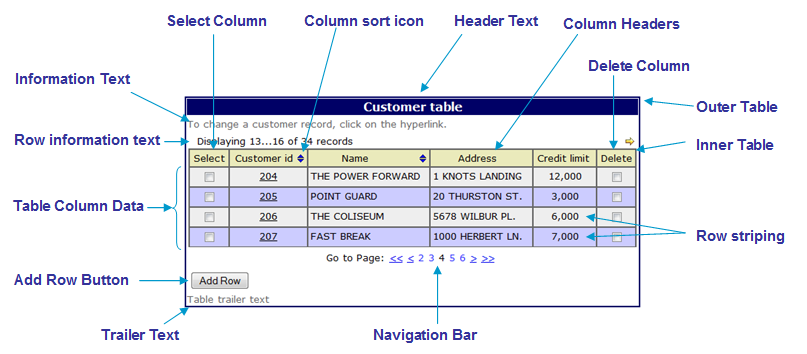
A Table Control is displayed using two HTML tables:
- an outer table that contains the header text, information text, row information text, inner table, navigation bar, add row button and trailer text
- an inner table that contains column header texts and the table row data
The following diagram shows the main features of a Table Control. See the properties below for further details.
Navigation Bar
See also navigation bar and vertical scrolling.
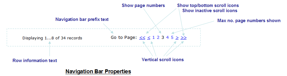
Navigation Bar features:
· The navigation bar can be omitted, displayed above the table, displayed below the table, or displayed both above and below the table
·
The navigation bar can be aligned centrally,
left or right
· Vertical scrolling can be displayed as icons or as texts as shown above (chevrons). Texts are used when no image URL has been specified for a vertical scroll icon property. When texts are used, they are taken from System texts 381 – 384.
· The scroll to top and scroll to bottom icons/texts are optional.
· The display of clickable page numbers is optional and the number of page number links displayed can be configured.
· Scroll icons/texts and page numbers are considered active when they can be clicked and inactive when they can’t be clicked e.g. a scroll up icon would be inactive when the first page is displayed. The display of inactive icons/texts can optionally be suppressed.
Properties
See also control common properties and local/inherited control properties.
Runtime only properties
|
Property |
Description |
Name1 |
Type1 |
Get1 |
Set1 |
|
Visible
row |
When read, this property returns
the internal row number of the first row currently visible to the user i.e. the
first row in the current scroll set. Returns -1 when the table is empty. When set with an internal row
number, the table row is made visible i.e. the system will scroll the table
to make the row visible. Invalid row numbers are ignored. |
visibleRow |
Integer |
Yes |
Yes |
|
First Display Row |
This read only property returns
the internal row number of the first display row – equivalent to scroll to top.
This can be used in conjunction with the visibleRow property above to
programmatically scroll to the top e.g. set table1.visibleRow =
table1.firstDisplayRow; Returns -1 when the table is
empty. |
firstDisplayRow |
Integer |
Yes |
No |
Style Tab
|
Description |
Name1 |
Type1 |
Get1 |
Set1 |
Get/Set
Values1 |
|
|
Class |
This class is applied to the outer HTML table tag which sounds any table texts and the table main content. |
cssClass |
Character |
Yes |
Yes |
A list of CSS class names delimited by a space. |
Html Element Properties Tab
See Html Element Properties Assistant for more information about these properties.
In addition to its Root Element, Html Element Properties can be configured for its Add Row Button. If the Table Control is in a Repeater Control the Id Html Element Property is disabled for every element in the Control.

Root Tab
The Table controls root element is its table element, the first element of a Table Control.
As the Html Element Properties Assistant explains, events Bubble up the DOM, so Event Handlers added to the Root element will respond to events generated in the rest of the Control, including any columns (because this element surrounds it). For example if an onclick Html Event Handler has been added to the Root element then it will be run whenever a User click in any part of the Control. If an Event Handler is configured for the Add Row Button, in any columns, then code in those Event Handlers will run first, followed by the code in the Root Handler.
Add Row Button
The Add Row Button is an input element and the Html Element Properties configured in the Add Row Button tab are added to this element.
Table Control Tab
|
Property |
Description |
Name1 |
Type1 |
Get1 |
Set1 |
Get/Set Values1 |
|
Table name |
The name of the table displayed by this Table Control; this is displayed as a hyperlink. Click on the link to navigate to the table properties. |
|
Character |
No |
No |
|
|
No. visible rows |
Indicates the number of rows presented to the user. When more rows exist in the table, the navigation bar is displayed. Set this property to a value of 0 or remove the value to indicate that all rows should be displayed without scrolling. |
numVisibleRows |
Integer |
Yes |
Yes |
|
|
Activates the user
row insertion built-in feature. This results in the display of the Add Row button underneath the table
row data. |
insertable |
Boolean |
Yes |
Yes |
|
|
|
Activates the user row deletion built-in feature. This results in the display of the Delete column as the rightmost table column. See also delete column properties. |
deletable |
Boolean |
Yes |
Yes |
|
|
|
Activates the user row selection built-in feature. This results in the display of the Select column as the leftmost table column. See also select column properties. |
selectable |
Boolean |
Yes |
Yes |
|
|
|
Show column headers |
Indicates whether or not column headers are displayed. Note that if this option is selected, column headers will be displayed, even for empty tables. |
showColumnHeaders |
Boolean |
Yes |
Yes |
|
|
Sets the width below which the table display collapses to show each row vertically down the page. This should be specified in standard CSS width units e.g. 768px, 40rem etc. If this property is not set the table will always be displayed horizontally. See Collapsible Tables. |
collapseBreakPoint |
Character |
Yes |
Yes |
See description |
|
|
Filter expression |
An FPL conditional expression that limits which table rows are displayed. The expression is applied to each row in the underlying table when the page is prepared for output. The expression can refer to any form field or table column and must evaluate to true or false. Click the .. button to edit the filter expression in an expanded panel. This might be used to implement nested tables or to hide certain rows etc e.g. · ORDERS-CUSTOMER_ID = CUSTOMER-CUSTOMER_ID · TAB1-SECURE_ROW != 'Y' · TAB1-TRANS_LIMIT > STANDARD_LIMIT Click here for more information on how filter expressions are used to implement nested tables. |
filterExpression |
Character |
Yes |
Yes |
|
Events Tab
|
Property |
Description |
Name1 |
Type1 |
Get1 |
Set1 |
Get/Set Values1 |
|
Before Table |
Configure scripts to run at the before table event. This event is fired when the page on which the control appears is first prepared for processing. It can be used to prepare the table for display for the first time. For example, data could be loaded from the database using fetchtable, certain columns could be hidden or made visible or totals fields calculated etc. This event is only fired when the user moves forwards to the page containing the table using the next page button or as a result of an FPL goto page command or Javascript WebForm.gotoPage() method. It is not fired when the page is re-displayed or when the previous page button is clicked. See Events for more information. |
|
|
No |
No |
|
|
After Table |
Configure scripts to run at the after table event. This event is fired after information has been received by the user and when all validation events for table cells have completed successfully. This event is not fired if the user clicks on a scroll icon, a sort icon or clicks the add row button. See Events for more information. |
|
|
No |
No |
|
|
Add Row |
Configure scripts to run at the add row event. This
event is fired when the user clicks the add
row button which is only displayed when the built-in feature: user row insertion option is
used. This event is provided to allow the application to supply values for
the new row. See Events for more
information. |
|
|
No |
No |
|
Texts Tab
|
Property |
Description |
Name1 |
Type1 |
Get1 |
Set1 |
Get/Set Values1 |
|
Header text |
The table header text. If no text is specified, the table header is omitted. |
tableHeaderText |
Character |
Yes |
Yes |
|
|
Info text |
The table information text. If no text is specified, the
table information is omitted. |
tableInfoText |
Character |
Yes |
Yes |
|
|
Trailer text |
The table trailer text. If no text is specified, the table
trailer is omitted. |
tableTrailerText |
Character |
Yes |
Yes |
|
PDF Tab
|
Property |
Description |
Name1 |
Type1 |
Get1 |
Set1 |
Get/Set Values1 |
|
Show column headers on each page |
When a page is printed to a PDF, column headers will be re-displayed at the top of each expansion page. See Designing Print Pages. |
showTableHeadersOverPDFPages |
Boolean |
Yes |
Yes |
|
|
Page break only on new row |
When a page is printed to a PDF, this ensures that the content of a table row will not be split across two pages. See Designing Print Pages. |
startNewRowOnNextPage |
Boolean |
Yes |
Yes |
|
Styling Assistant
The properties and the Interactive Preview are divided into sections that represent different parts of a Table Control. Each section can be selected from the Edit Properties dropdown or by clicking on the appropriate area in the preview. The sections are:
- Table Control – properties for the entire control
- Table Header – properties for the table header text
- Table Information – properties for the table information text
- Navigation Bar – properties for the navigation bar both at the top and/or the bottom
- Column Header – properties for column header texts
- Table Columns – properties for the table data (rows and columns)
- Add Row Button – properties for the optional Add Row button
- Table Trailer – properties for the table trailer text
|
Property |
Description |
Name1 |
Type1 |
Get1 |
Set1 |
Get/Set Values1 |
Table Control |
The following properties apply to the entire Table Control |
|
|
|
|
|
|
Width |
Sets the width for the entire Table Control. Warning: any margins will be in addition to the specified value and can cause the Table Control to “break out” of its parent space. Click here for further info. See also: hints and tips, understanding width. |
width |
Character |
Yes |
Yes |
As per CSS width property. |
|
Text |
Sets default text properties for the entire control: font, size, color, bold, italic etc. See text properties. |
tableStyleProperties .xxx |
|
|
|
|
|
Background |
Background properties for the entire control. See background properties. |
tableStyleProperties .xxx |
|
|
|
|
|
Border |
Border properties for the entire control. See border properties. |
tableStyleProperties .xxx |
|
|
|
|
|
Margin |
Margin is the space beyond the border. See padding and margin properties. |
tableStyleProperties .xxx |
|
|
|
|
|
|
|
|
|
|
|
|
|
Style |
CSS class and inline style for the outer table. |
cssClass style |
Character |
Yes |
Yes |
As per HTML class parameter As per HTML style parameter |
Table Header |
The following
properties apply to the table header text |
|
|
|
|
|
|
Text |
Table header text properties: font, size, color, bold, italic etc. See text properties. |
headerStyleProperties .xxx |
|
|
|
|
|
Background |
Table header background properties. See background properties. |
headerStyleProperties .xxx |
|
|
|
|
|
Border |
Table header border properties. See border properties. |
headerStyleProperties .xxx |
|
|
|
|
|
Padding |
Padding is the space between the table header text and its border. See padding and margin properties. |
headerStyleProperties .xxx |
|
|
|
|
|
Alignment |
Horizontal alignment for the table header text. |
headerStyleProperties .hAlign |
Character |
Yes |
Yes |
Click here for values. Value Fill is not supported. |
|
|
|
|
|
|
|
|
|
Style |
CSS class and inline style for the table header text. |
headerClass headerStyle |
Character |
Yes |
Yes |
As per HTML class parameter As per HTML style parameter |
Table Information |
The following
properties apply to the table information text |
|
|
|
|
|
|
Text |
Table information text properties: font, size, color, bold, italic etc. See text properties. |
informationStyleProperties .xxx |
|
|
|
|
|
Background |
Table information text background properties. See background properties. |
informationStyleProperties .xxx |
|
|
|
|
|
Border |
Table information text border properties. See border properties. |
informationStyleProperties .xxx |
|
|
|
|
|
Padding |
Padding is the space between the table information text and its border. See padding and margin properties. |
informationStyleProperties .xxx |
|
|
|
|
|
Alignment |
Horizontal alignment for the table information text. |
informationStyleProperties .hAlign |
Character |
Yes |
Yes |
Click here for values. Value Fill is not supported. |
|
|
|
|
|
|
|
|
|
Style |
CSS class and inline style for the table information text. |
infoClass infoStyle |
Character |
Yes |
Yes |
As per HTML class parameter As per HTML style parameter |
Navigation Bar |
The following properties apply to the Navigation Bar |
|
|
|
|
|
|
Text |
Sets default text properties for the navigation bar: font, size, color, bold, italic etc. See text properties. |
navigationStyleProperties .xxx |
|
|
|
|
|
Background |
Navigation bar background properties. See background properties. |
navigationStyleProperties .xxx |
|
|
|
|
|
Position |
Controls positioning of the navigation bar. This can be above the table, below the table, both of these, or none (navigation bar is not displayed). |
navigationDisplay |
Character |
Yes |
Yes |
T (above) U (below) B (both) null (none) |
|
Icons |
Shows a dialog to configure image locations of all horizontal and vertical scrolling icons with the properties shown below. |
|
|
|
|
|
|
Active icons: |
|
|
|
|
|
|
|
Scroll to top icon |
|
scrollToTopIcon |
Character |
Yes |
Yes |
See URL properties. |
|
Scroll to bottom icon |
|
scrollToBottomIcon |
Character |
Yes |
Yes |
See URL properties. |
|
Scroll up icon |
|
scrollUpIcon |
Character |
Yes |
Yes |
See URL properties. |
|
Scroll down icon |
|
scrollDownIcon |
Character |
Yes |
Yes |
See URL properties. |
|
Inactive
icons: |
|
|
|
|
|
|
|
Scroll to top icon |
|
inactiveScrollToTopIcon |
Character |
Yes |
Yes |
See URL properties. |
|
Scroll to bottom icon |
|
inactiveScrollToBottomIcon |
Character |
Yes |
Yes |
See URL properties. |
|
Scroll up icon |
|
inactiveScrollUpIcon |
Character |
Yes |
Yes |
See URL properties. |
|
Scroll down icon |
|
inactiveScrollDownIcon |
Character |
Yes |
Yes |
See URL properties. |
|
Horizontal Scrolling Icons: |
|
|
|
|
|
|
|
Scroll left icon |
|
scrollLeftIcon |
Character |
Yes |
Yes |
See URL properties. |
|
Scroll right icon |
|
scrollRightIcon |
Character |
Yes |
Yes |
See URL properties. |
|
Top Align |
The alignment of the navigation bar relative to the table when the bar is displayed above the table. |
navigationAlignTop |
Character |
Yes |
Yes |
L (left) R (right) C (center) |
|
Bottom Align |
The alignment of the navigation bar relative to the table when the bar is displayed below the table. |
navigationAlignBottom |
Character |
Yes |
Yes |
L (left) R (right) C (center) |
|
Border |
Navigation bar border properties. See border properties. |
navigationStyleProperties .xxx |
|
|
|
|
|
Padding |
Padding is the space between the navigation bar and its border. See padding and margin properties. |
navigationStyleProperties .xxx |
|
|
|
|
|
Additional Information Texts: |
The following properties apply to the optional navigation bar prefix text and the number of rows information text. See above. |
|||||
|
Display navigation bar prefix text |
Indicates whether or not the navigation bar prefix text is displayed (Go to Page: in the example above). This text is taken from System text 380. This text is styled using the Row information style property. |
displayInfoPrefix |
Boolean |
Yes |
Yes |
|
|
Display no. rows information text |
Indicates whether or not the row information text is displayed. This text shows the number of records. The default text Displaying …. of … records is built using system texts 370, 371, 372, 373 |
showInfoMessage |
Boolean |
Yes |
Yes |
|
|
Nav bar prefix text |
Navigation bar prefix text properties: font, size, color, bold, italic etc. See text properties. |
rowPrefixProperties .xxx |
|
|
|
|
|
No. rows info text |
Row information text properties: font, size, color, bold, italic etc. See text properties. |
rowInformationProperties .xxx |
|
|
|
|
|
Page Numbers: |
|
|
|
|
|
|
|
Display |
Activates the display of clickable page numbers |
includePageNumbers |
Boolean |
Yes |
Yes |
|
|
Number of Pages |
The number of page numbers shown when the previous property Display has been selected. |
maxNumberOfResultPages |
Integer |
Yes |
Yes |
|
|
Page No. Text |
Text properties for inactive page numbers i.e. pages other than the currently displayed page: font, size, color, bold, italic etc. See text properties. |
inactivePageNumberProperties .xxx |
|
|
|
|
|
Current Page Text |
Text properties for the currently displayed page: font, size, color, bold, italic etc. See text properties. |
activePageNumberProperties .xxx |
|
|
|
|
|
Gap |
The space between page numbers and scrolling icons/texts in the navigation bar. |
navigationStyleProperties .spacerSize |
|
|
|
As per CSS width property. |
|
Page Navigation: |
|
|
|
|
|
|
|
Display scroll to top/bottom |
Activates the display of the scroll to top and scroll to bottom icons or corresponding texts. |
displayScrollTopBottomIcons |
Boolean |
Yes |
Yes |
|
|
Display inactive scrolling |
Determines whether inactive scroll icons/texts are displayed. For example when this property is checked, scroll up and scroll to top icons/texts are displayed when the first page of a scroll set is displayed. |
showInactiveScrollIcons |
Boolean |
Yes |
Yes |
|
|
Navigation Text |
Text properties for active icons/texts: font, size, color, bold, italic etc. See text properties. |
pageNavigationProperties .xxx |
|
|
|
|
|
Inactive Navigation Text |
Text properties for inactive vertical scroll icons/texts: font, size, color, bold, italic etc. See text properties. |
inactivePageNavigationProperties .xxx |
|
|
|
|
|
|
|
|
|
|
|
|
|
Navigation bar style |
CSS class and inline style applied to the <div> tag containing the entire navigation bar. |
navigationBarClass navigationBarStyle |
Character |
Yes |
Yes |
As per HTML class parameter As per HTML style parameter |
|
Navigation bar prefix style |
CSS class and inline style applied to the navigation bar prefix text. |
infoPrefixClass infoPrefixStyle |
Character |
Yes |
Yes |
As per HTML class parameter As per HTML style parameter |
|
Row information style |
CSS class and inline style applied to the number of records row information text. |
rowInformationClass rowInformationStyle |
Character |
Yes |
Yes |
As per HTML class parameter As per HTML style parameter |
|
Active vertical scroll icon style |
CSS class and inline style applied to active vertical scroll icons/texts. |
navigationClass navigationStyle |
Character |
Yes |
Yes |
As per HTML class parameter As per HTML style parameter |
|
Inactive vertical scroll icon style |
CSS class and inline style applied to inactive vertical scroll icons/texts. |
inactiveNavigationClass inactiveNavigationStyle |
Character |
Yes |
Yes |
As per HTML class parameter As per HTML style parameter |
|
Active page numbers style |
CSS class and inline style applied to active page numbers – pages other than the current page. This can be modified if required to provide separate style for active and hover links by adding the appropriate pseudo-class selector rule to the stylesheet e.g. a.myclass:hover. |
pageNumbersClass pageNumbersStyle |
Character |
Yes |
Yes |
As per HTML class parameter As per HTML style parameter |
|
Current page number style |
CSS class and inline style applied to inactive pages i.e. the current page number. This can be modified if required to provide separate style for active and hover links by adding the appropriate pseudo-class selector to the stylesheet e.g. a.myclass:hover. |
currentPageClass currentPageStyle |
Character |
Yes |
Yes |
As per HTML class parameter As per HTML style parameter |
|
Horizontal scroll icon style |
CSS class and inline style applied to the horizontal scroll icons. |
tablePageScrollClass tablePageScrollStyle |
Character |
Yes |
Yes |
As per HTML class parameter As per HTML style parameter |
Column Headers |
The following
properties apply to table column header texts |
|
|
|
|
|
|
Text |
Column header text properties: font, size, color, bold, italic etc. See text properties. |
columnHeaderStyleProperties .xxx |
|
|
|
|
|
Background |
Column header text background properties. See background properties. |
columnHeaderStyleProperties .xxx |
|
|
|
|
|
Border |
Column header text border properties. See border properties. |
columnHeaderStyleProperties .xxx |
|
|
|
|
|
Padding |
Padding is the space between the Column header text and its border. See padding and margin properties. |
columnHeaderStyleProperties .xxx |
|
|
|
|
|
Alignment |
Horizontal alignment for the column header texts. |
columnHeaderStyleProperties .hAlign |
Character |
Yes |
Yes |
Click here for values. Value Fill is not supported. |
|
Pattern Text |
Text properties for the value pattern text: font, size, color, bold, italic etc. See text properties. This text provides information to the user on the format of data to be entered for date/time columns e.g. hh:mm:ss, mm/dd/yyyy etc. Display of the value pattern text is selected and configured using Field Column properties; when selected, it is displayed immediately beneath the column header text. Value pattern texts are only shown for table columns with display type Text and type DATE, TIME or DATETIME. |
columnHeaderStyleProperties .valuePatternProperties .xxx |
|
|
|
|
|
Sort Icon Properties: |
The following properties apply to the sort icon displayed next to the column header text when the Sortable property for a Table Column Control is checked. |
|
|
|
|
|
|
Width |
Sort icon width. |
tableSortProperties.width |
|
|
|
|
|
Height |
Sort icon height. |
tableSortProperties.height |
|
|
|
|
|
Border |
Sort icon border properties. See border properties. |
tableSortProperties.xxx |
|
|
|
|
|
Ascending Icon |
The URL of the column header icon to sort the table in ascending order. System text 389 is used as the alternate text. |
sortAscendingIcon |
Character |
Yes |
Yes |
See URL properties. |
|
Descending Icon |
The URL of the column header icon to sort the table in descending order. System text 390 is used as the alternate text. |
sortDescendingIcon |
Character |
Yes |
Yes |
See URL properties. |
|
Unsorted Icon |
The URL of the column header icon when the table is not sorted by this column. System text 389 is used as the alternate text. |
unsortedIcon |
Character |
Yes |
Yes |
See URL properties. |
|
|
|
|
|
|
|
|
|
Style |
CSS class and inline style applied to column headers. |
columnHeadingClass columnHeadingStyle |
Character |
Yes |
Yes |
As per HTML class parameter As per HTML style parameter |
|
Value pattern text style |
CSS class and inline style applied to the value pattern text. This text provides information to the user on the format of data to be entered for date/time columns e.g. hh:mm:ss, mm/dd/yyyy etc. Display of the value pattern text is selected and configured using Field Column properties; when selected, it is displayed immediately beneath the column header text. Value pattern texts are only shown for table columns with display type Text and type DATE, TIME or DATETIME. |
patternTextClass patternTextStyle |
Character |
Yes |
Yes |
As per HTML class parameter As per HTML style parameter |
|
Sort icon style |
CSS class and inline style applied to the column header sort icons. |
tableSortClass tableSortStyle |
Character |
Yes |
Yes |
As per HTML class parameter As per HTML style parameter |
Table Columns |
The following
properties apply to the table data (rows and columns) |
|
|
|
|
|
|
The following two properties apply background properties |
|
|
|
|
|
|
|
Background |
Background properties for all table columns. See background properties. In addition, property stripeColor specifies the background color used for alternate rows. |
tableRowStyleProperties .xxx |
|
|
|
|
|
Stripe color |
The stripe color is applied as a background color to alternate table rows. If not specified, the previous Background color property is applied to all rows. |
stripeColor |
Character |
Yes |
Yes |
As CSS background-color property |
|
Cell Properties |
The following properties apply to all columns. |
|
|
|
|
|
|
Text |
Text properties for all table columns: font, size, color, bold, italic etc. See text properties. |
tableCellStyleProperties .xxx |
|
|
|
|
|
Background |
Cell background properties for all table columns. See background properties. This overrides the Table Column Background property above, but will not override the Table Column Stripe color property. |
tableCellStyleProperties .xxx |
|
|
|
|
|
Border |
Border properties for all table columns. See border properties. |
tableCellStyleProperties .xxx |
|
|
|
|
|
Padding |
Padding is the space between the table cell contents and its border. This applies to all table columns. See padding and margin properties. |
tableCellStyleProperties .xxx |
|
|
|
|
|
Alignment |
Horizontal alignment of the table cell contents for all table columns. |
tableCellStyleProperties .hAlign |
Character |
Yes |
Yes |
Click here for values. Value Fill is not supported. |
|
Vertical Alignment |
Vertical alignment of the table cell contents for all table columns. |
tableCellStyleProperties .vAlign |
Character |
Yes |
Yes |
Click here for values. Value Fill is not supported. |
|
The following properties apply to the select column. See user row selection for details. |
|
|
|
|
|
|
|
Width |
Width of the select column. |
selectableWidth |
Character |
Yes |
Yes |
As per CSS width property |
|
Text |
Select column text properties: font, size, color, bold, italic etc. See text properties. |
tableSelectStyleProperties .xxx |
|
|
|
|
|
Background |
Select column background properties. See background properties. |
tableSelectStyleProperties .xxx |
|
|
|
|
|
Border |
Select column border properties. See border properties. |
tableSelectStyleProperties .xxx |
|
|
|
|
|
Alignment |
Horizontal alignment of the select checkbox. |
tableSelectStyleProperties .hAlign |
Character |
Yes |
Yes |
Click here for values. Value Fill is not supported. |
|
Vertical Alignment |
Vertical alignment of the select checkbox. |
tableSelectStyleProperties .vAlign |
Character |
Yes |
Yes |
Click here for values. Value Fill is not supported. |
|
The following properties apply to the delete column. See user row deletion for details. |
|
|
|
|
|
|
|
Width |
Width of the delete column. |
deletableWidth |
Character |
Yes |
Yes |
As per CSS width property |
|
Text |
Delete column text properties: font, size, color, bold, italic etc. See text properties. |
tableDeleteStyleProperties .xxx |
|
|
|
|
|
Background |
Delete column background properties. See background properties. |
tableDeleteStyleProperties .xxx |
|
|
|
|
|
Border |
Delete column border properties. See border properties. |
tableDeleteStyleProperties .xxx |
|
|
|
|
|
Alignment |
Horizontal alignment of the delete checkbox. |
tableDeleteStyleProperties .hAlign |
Character |
Yes |
Yes |
Click here for values. Value Fill is not supported. |
|
Vertical Alignment |
Vertical alignment of the delete checkbox. |
tableDeleteStylePropertie s.vAlign |
Character |
Yes |
Yes |
Click here for values. Value Fill is not supported. |
|
|
|
|
|
|
|
|
|
Row cell style |
CSS class and inline style applied to the table cells used to present table row data. Note that this property can also be specified locally by individual columns, in which case both sets of style are applied. When a CSS class is specified both with this property and locally, the order in which the class appears in the browser is important – the class loaded last has precedence. |
tableRowCellClass tableRowCellStyle |
Character |
Yes |
Yes |
As per HTML class parameter As per HTML style parameter |
|
Row data style |
CSS class and inline style applied to the table row data. Note that this property can also be specified locally by individual columns, in which case both sets of style are applied. When a CSS class is specified both with this property and locally, the order in which the class appears in the browser is important – the class loaded last has precedence. |
tableRowDataClass tableRowDataStyle |
Character |
Yes |
Yes |
As per HTML class parameter As per HTML style parameter |
|
Select column cell style |
CSS class and inline style applied to the select column table cells. |
selectableCellClass selectableCellStyle |
Character |
Yes |
Yes |
As per HTML class parameter As per HTML style parameter |
|
Select column data style |
CSS class and inline style applied to the select column checkboxes. |
selectableDataClass selectableDataStyle |
Character |
Yes |
Yes |
As per HTML class parameter As per HTML style parameter |
|
Delete column cell style |
CSS class and inline style applied to the delete column table cells. |
deletableCellClass deletableCellStyle |
Character |
Yes |
Yes |
As per HTML class parameter As per HTML style parameter |
|
Delete column data style |
CSS class and inline style applied to the delete column checkboxes. |
deletableDataClass deletableDataStyle |
Character |
Yes |
Yes |
As per HTML class parameter As per HTML style parameter |
|
Table grid style |
CSS class and inline style applied to the inner table containing column headers and table row data. |
tableGridClass tableGridStyle |
Character |
Yes |
Yes |
As per HTML class parameter As per HTML style parameter |
|
Collapsed row style |
CSS style that is applied to the tr tag for each row when the table is collapsed. See Collapsible Tables. |
collapsedRowStyle |
Character |
Yes |
Yes |
As per HTML class parameter As per HTML style parameter |
|
Collapsed row header style |
CSS style that is applied to column header texts when the table is collapsed. See Collapsible Tables. |
collapsedRowHeaderStyle |
Character |
Yes |
Yes |
As per HTML class parameter As per HTML style parameter |
Add Row Button |
The following properties apply to the optional Add Row Button |
|
|
|
|
|
|
Row background color |
Background properties for the table row that contains the add row button. This is applied to the full width of the table. See background properties. |
addRowStyleProperties .addRowCellProperties .xxx |
|
|
|
|
|
Alignment |
Horizontal alignment for the add row button. |
addRowStyleProperties .addRowCellProperties .hAlign |
Character |
Yes |
Yes |
Click here for values. Value Fill is not supported. |
|
Padding |
Padding is the space between the add row button and its border. See padding and margin properties. |
addRowStyleProperties .addRowCellProperties .xxx |
|
|
|
|
|
Add Row Button: |
|
|
|
|
|
|
|
Width |
The width of the button. |
addRowStyleProperties .addRowButtonProperties .width |
Character |
Yes |
Yes |
As per CSS width property. |
|
Text |
Button text properties: font, size, color, bold, italic etc. See text properties. |
addRowStyleProperties .addRowButtonProperties .xxx |
|
|
|
|
|
Background color |
The background color of the button. |
addRowStyleProperties .addRowButtonProperties .backgroundColor |
Character |
Yes |
Yes |
As CSS background-color property |
|
Border |
Button border properties. See border properties. |
addRowStyleProperties .addRowButtonProperties .xxx |
|
|
|
|
|
Bootstrap: These properties are only available when a form is configured to use bootstrap i.e. the framework property in Form Properties is configured to use bootstrap (by default this property is inherited from the Presentation Template). See Using Bootstrap with Verj.io. |
||||||
|
Style |
Sets the Bootstrap style. This results in the addition of the appropriate bootstrap classes. |
bootstrapStyle |
Character |
Yes |
Yes |
Primary Secondary Success Danger Warning Info Light Dark Link Outline Primary Outline Secondary Outline Success Outline Danger Outline Warning Outline Info Outline Light Outline Dark |
|
Size |
Sets the Bootstrap size. This results in the addition of the appropriate bootstrap classes. |
bootstrapSize |
Character |
Yes |
Yes |
Large Small |
|
State |
Sets the Bootstrap state. This results in the addition of the appropriate bootstrap classes. |
bootstrapState |
Character |
Yes |
Yes |
Active Disabled |
|
|
|
|
|
|
|
|
|
Cell Style |
CSS class and inline style applied to the add row button. |
addRowCellClass aadRowCellStyle |
Character |
Yes |
Yes |
As per HTML class parameter As per HTML style parameter |
|
Button Style |
CSS class and inline style applied to the table row containing the add row button. |
addRowClass addRowStyle |
Character |
Yes |
Yes |
As per HTML class parameter As per HTML style parameter |
Table Trailer |
The following
properties apply to the table trailer text |
|
|
|
|
|
|
Text |
Table trailer text properties: font, size, color, bold, italic etc. See text properties. |
trailerStyleProperties .xxx |
|
|
|
|
|
Background |
Table trailer text background properties. See background properties. |
trailerStyleProperties .xxx |
|
|
|
|
|
Border |
Table trailer text border properties. See border properties. |
trailerStyleProperties .xxx |
|
|
|
|
|
Padding |
Padding is the space between the table trailer text and its border. See padding and margin properties. |
trailerStyleProperties .xxx |
|
|
|
|
|
Alignment |
Horizontal alignment for the table trailer text. |
trailerStyleProperties .hAlign |
Character |
Yes |
Yes |
Click here for values. Value Fill is not supported. |
|
|
|
|
|
|
|
|
|
Style |
CSS class and inline style for the table trailer text. |
trailerClass trailerStyle |
Character |
Yes |
Yes |
As per HTML class parameter As per HTML style parameter |
1 See accessing control properties from scripts
Collapsible Tables
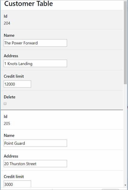
The term Collapsible Table means changing the display of a table from horizontal to vertical for devices below a certain device width threshold as illustrated below - typically this is used to display a table on a phone or any other device that doesn’t have sufficient width. The collapse breakpoint is configured in Table Control properties and specifies the width below which this occurs, if this property is not set the table will always be displayed horizontally. The collapsed table style can be configured with two advanced properties in the styling dialog Table Columns tab: Collapsed row style and Collapsed row header style.

Normal horizontal display (devices > 768px):
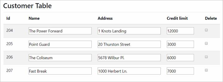
Collapsed vertical display (devices =< 768px):
Setting Properties Programmatically
Examples of setting properties via Javascript:
controls.button1.textColor
= "#FF0099";
controls.myTable.width = "300px";
controls.TABLE1.tableStyleProperties.textColor
= "#000000";
controls.TABLE1.headerStyleProperties.textColor
= "#000000";
controls.TABLE1.informationStyleProperties.textColor
= "#000000";
controls.TABLE1.trailerStyleProperties.textColor
= "#000000";
controls.TABLE1.navigationStyleProperties.backgroundColor
= "#FF9999";
controls.TABLE1.scrollToTopIcon
= "myimages/scrolltop.gif";
controls.TABLE1.showInfoMessage
= false;
controls.TABLE1.navigationAlignBottom
= "L";
controls.TABLE1.addRowStyleProperties.addRowButtonProperties.textColor
= "#000000";
controls.TABLE1.deletable
= true;
controls.TABLE1.selectable
= true;
controls.TABLE1.tableHeaderText=
"New Header";
controls.TABLE1.visibleRow
= rememberedRow; // rememberedRow
is a variable containing a valid row number
Examples of setting properties via FPL:
set TABLE1.width =
'300px';
set
TABLE1.tableStyleProperties.textColor = '#000000';
set TABLE1.headerStyleProperties.textColor
= '#000000';
set
TABLE1.informationStyleProperties.textColor = '#000000';
set
TABLE1.trailerStyleProperties.textColor = '#000000';
set
TABLE1.navigationStyleProperties.backgroundColor = '#FF9999';
set TABLE1.scrollToTopIcon
= 'myimages/scrolltop.gif';
set
TABLE1.showInfoMessage = 'false';
set
TABLE1.navigationAlignBottom = 'L';
set
TABLE1.addRowStyleProperties.addRowButtonProperties.textColor = '#000000';
set TABLE1.deletable
= 'true';
set TABLE1.selectable
= 'true';
set
TABLE1.tableHeaderText= 'New Header';
set
TABLE1.visibleRow = REMEMBERED_ROW; // REMEMBERED_ROW is a field
of type Integer containing a valid row number
Right Click Menu Actions
Click here for right-click menu actions available to all controls.
Table control right click menu actions:
- Add Columns – presents a list of columns available. Selected columns are added directly to the Table Control and can be moved to the desired Table Page.
- Add Table Page – adds a Table Page control.
Moving Table Columns
Table columns can be selected by clicking any part of their displayed area, and can be moved by dragging and dropping over another column location.
Control Widget
The Table Control widget is shown when the control is selected in the WYSIWYG View:
The widget acts as an assistant for manipulating table column widths. Note that there can be discrepancies between the column widths shown in the widget and the column widths shown immediately below in the WYSIWYG View, click here for further details.
Hints and Tips
Control overflows to the right
The Table Control seems to break out of the parent control space. This problem typically occurs when a left margin has been configured for the Table Control. Click here for solutions to this problem.
Appearance in Outline View
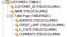
A Table Control is shown with the table name first followed by the table control name in brackets: