Form Properties – Presentation Tab


Documentation home

Form Properties Summary


It is possible to set default values for many of these form properties in the presentation template associated with a form. The default properties are configured in the Form section under Property Sets within the Presentation Template Editor.


Presentation tab
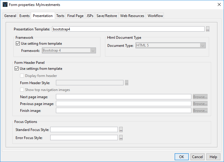


Property

Description

Presentation template

The presentation template associated with this form. Hovering the mouse over the name will display the full path. Double clicking on the template name will open the template editor. Clicking the … button displays the Workspace Browser dialog and any presentation template in the current project or any linked project can be selected.


The presentation template controls the look and feel of the form, e.g. images, fonts, font sizes, colors, etc. in the browser. (See How Style is Applied and Working with presentation templates for more information).

Framework

The name of the styling framework used by this form or “None”. Changing this property may result in changes to the generated HTML and CSS to suit the styling framework or in changes to the list of available controls and changes to some control properties – additional features may be displayed to suit the framework. “None” means that the default HTML and CSS is generated and the default list of controls is displayed.


Currently supported frameworks:

  • Bootstrap 4: generates HTML/CSS suitable for use with Bootstrap 4. When this is selected, the Html Document Type property is set to HTML 5 and cannot be changed.


See Using Bootstrap with Verj.io


Html Document Type

This sets the document type (HTML or XHTML) and the version of HTML or XHTML used:


  • HTML5:  this is the distributed default and is the recommended choice
  • HTML4_TRANS: output is rendered in HTML to the HTML 4 transitional standard
  • HTML4_STRCT: output is rendered in HTML to the HTML 4 strict standard. Note that the strict standard is much more restrictive than transitional and may cause forms containing additional added HTML and/or JSPs to fail. You should only use this if you have an explicit reason to do so.
  • XHTM1_TRANS: output is rendered in XHTML to the XHTML 1 transitional standard
  • XHTM1_STRCT: output is rendered in XHTML to the XHTML 1 strict standard. Note that the strict standard is much more restrictive than transitional and may cause forms containing additional added HTML and/or JSPs to fail. You should only use this if you have an explicit reason to do so.


The default for this parameter is taken from Form Options tab of Designer Preferences.

Form Header Panel

Contains options to configure the form header text panel. The form header text is a single text that can be displayed at the top of each page. The text is configured in texts tab or by double clicking on the form header text in the WYSIWYG panel.


Use settings from template

Check this option to indicate that all settings are taken from the Form defaults section of the presentation template.

Display form header

Check this option to include the optional form header text panel at the top of each page of the form

Form Header Style

The CSS class and style applied to the form header text. Note that this styling can also be configured for each individual page using the Page Control Styling Assistant (and default Page Control values can be configured in a presentation template). When there is a conflict in these styling properties, the value specified here (in Form Properties) will be used.

Show top navigation images

Check this option to include the appropriate page navigation image buttons to the right of the form header text. These buttons are shown when a form header text exists and an image URL has been configured.

Next page image

The image URL of the next page image button. This is displayed when a next page exists. See Page Sequencing.

Previous page image

The image URL of the previous page image button located to the right of the form header text. This is displayed when a previous page exists.  See Page Sequencing.

Finish image

The image URL of the finish image button located to the right of the form header text. This is displayed when no next page exists.  See Page Sequencing.

Focus Options


Standard Focus Style

The CSS class and style used to highlight the current input field.

Error Focus Style

The CSS class and style applied to used to highlight the error input field.


See Controlling Browser Focus for more information on these options.